if you are an avid fan of korean fashion, park sora will be a familiar name to you.
she models for stylenanda, a korean fashion brand that houses a lot of quirky and stylish clothings.
while i'm not too interested in the clothes it has to offer, i'm really drawn to park sora's makeup.
i know she uses mostly 3ce products, since that is the makeup line produced by stylenanda!
today, i'm taking up the challenge to create her look WITHOUT any 3ce products.
can i do it with just drugstore products?
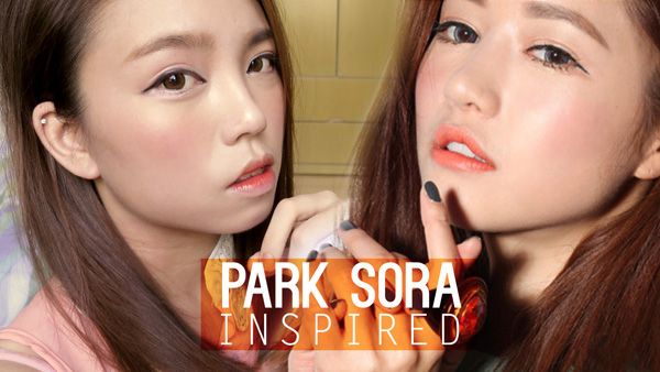
read on to find out how i did it!
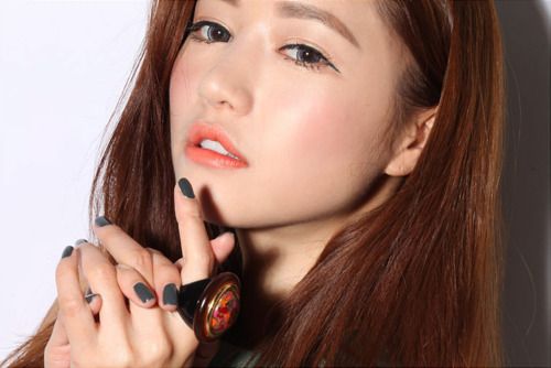
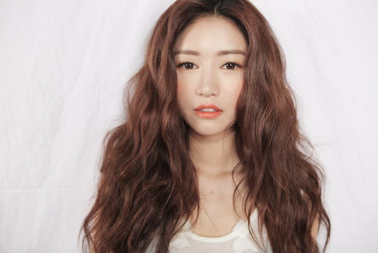
these were the main reference images that i used. thank you google!
DECONSTRUCTION:
FACE:
- extremely fair skinned with a glossy finish, either skip powdering of face, or to add extra sheen with a facial oil (either prior to foundation, or mixing it with the foundation).
- porcelain skin with no trace of a pore, can be achieved by using a skin smoothening primer prior to foundation.
EYES:
- bright eyes with orange toned eyeshadow
- high contrast eye make up by using bright eyeshadows and black eye liner
- close set eyes, line the inner corners and make it point towards the nose bridge for that long eye look
- straight and slightly droopy eyeliner that ends at the same level as the inner corner of eyes, this gives the illusion of lengthened eyes
- iris enlarging circle lens is a must for this look
- natural looking lashes that are rather volumous to contrast the bright eye look (especially so for the lower lash line). can be achieved with a volumnizing and lengthening mascara
CHEEKS:
- sun kissed cheeks, a bright coral/orange coloured blusher applied over the entire cheek
- highlighted and glossy, a pearl liquid/powder highlighter can be used on those areas
LIPS:
- orange pastel toned, requires either a very pigmented orange pastel lipstick, or simply conceal lips before applying regular orange lipstick
PRODUCTS USED:
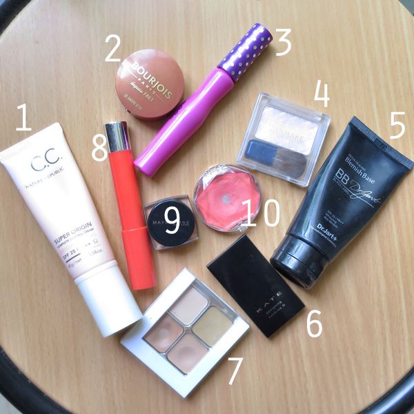
(in clockwise direction, starting from the far left)
1. nature republic brightening CC cream
2. bourjois blusher 32 ambre d'or
3. dollywink long mascara
4. canmake highlighter 05 (used as eyeshadow and highlight)
5. dr jart+ black label bb cream
6. kate designing eyebrow N EX-4
7. sonia kashuk hidden agenda concealer 07
8. revlon just bitten balm stain 040 rendezvous
9. maybelline eye studio gel liner black
10. canmake cream cheek 05
NOT IN PHOTO: the circle lens i wore is the GEO HC-104
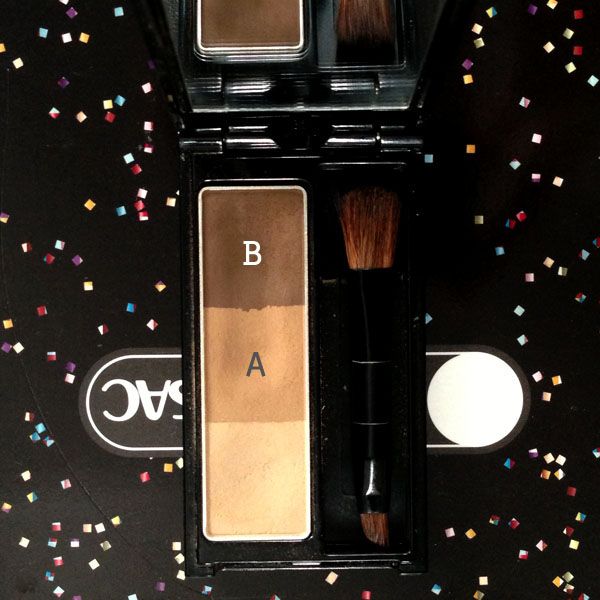
kate designing eyebrow N EX-4
this time round i'm using lighter shades for my eyebrow to get her softer brow look. i mixed A and B in a ratio of about 4:1 (brushing my brush in A for 4 times and B for 1 time)
COLOUR MAP:
EYESHADOW:
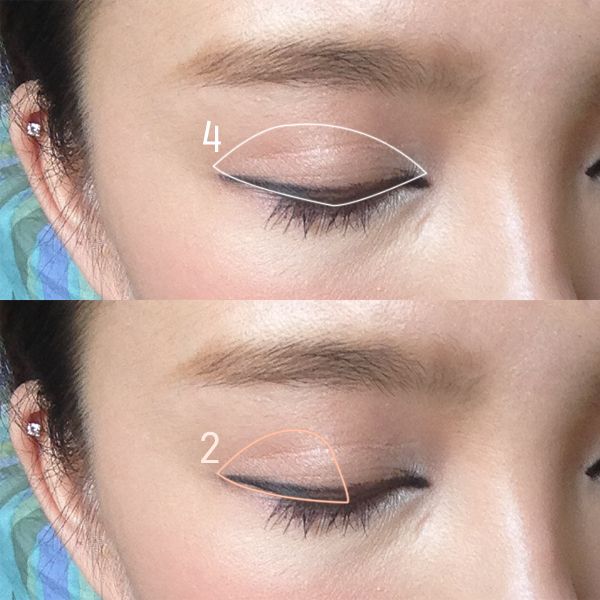
1. apply 1 all over the upper eyelid to brighten up the entier eye area
2. apply 2 to the outer half of the eyes.
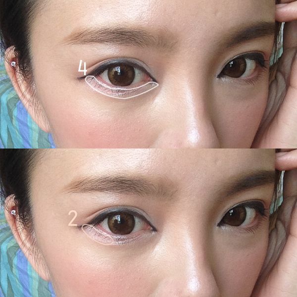
1.brighten up the entire lower lid with 4
2. add a tinge of orange to the outer corner of the lower lid
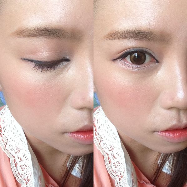
a closer look at the eyeliner.
there is no eyeliner applied to the lower lash line, the contrast is constructed by the dark lower lashes and the highlighter lower eyelid.
BLUSHER:
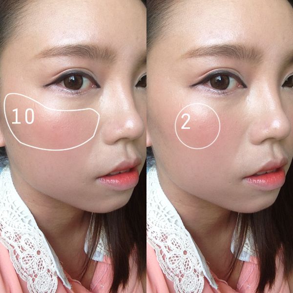
1. apply 10 over the entire cheek, we're going for the sunburnt look. HAHAHA
2. i added some of 2 onto the apple of my cheek for a soft gradated look
FINISHED LOOK:
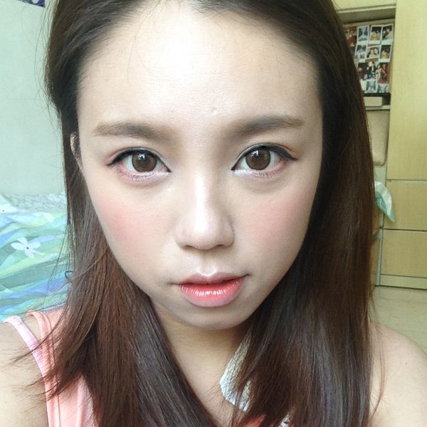
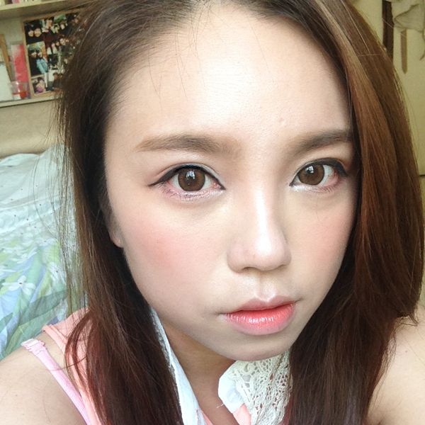
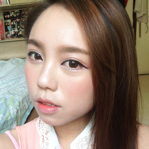
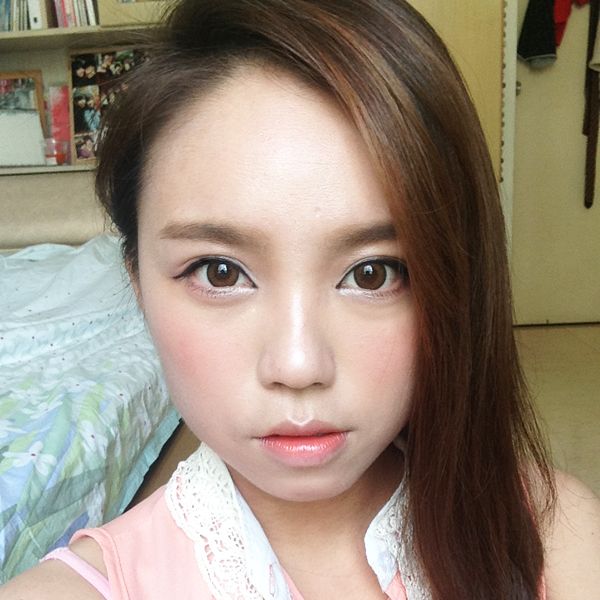
i think this look is pretty pictur perfect,i love how the contrast in the eyes brings out the sharp eye look. the sun kissed cheeks are also very summer-ready! i guess this look will suit most people, and especially those with fair skin. people with tanner skin might want to use a more vibrant cheek colour as opposed to the slightly pastel shades used here. as for the eye look, the eye shadow combination will suit everybody, but the way the eyeliner is drawn might need to be adjusted according to your own eye shape! but the general idea is the same: lengthening eyeliner that ends at the same height where the inner corner of the eyes is.




No comments:
Post a Comment