Wednesday, March 11, 2015

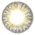
GEO Princess Mimi (Bambi) Sesame Grey WMM-305 Review
GEO Princess Mimi (bambi) Sesame Grey Photos and Review

sponsored review brought to you by yourbeautymagic. all opinions are my own.

yourbeautymagic is a new web store selling circle and coloured lenses. they're based in malaysia if you're curious! currently, they only sell GEO lenses. they've hit me up with a chance to try out two pairs of lenses, so i picked the ever so popular princess mimi series in sesame gray/grey (whichever spelling appeals to you! i can't make up my mind as you can see :P).

these lenses are sold in japan under the brand ANGEL COLOR, and it's named the BAMBI SERIES, and this series is produced by tsubaki masuwaka. the lens are in fact manufactured by GEO.

i've been wearing GEO lenses ever since i started experimenting with circle lenses. part of the reason is due to the fact that they're the more affordable ones, also, they just so happen to have the designs that i want as opposed to other brands like EOS, DUEBA, or G&G.

yourbeautymagic review
the lenses are wrapped up with foam padding, no chance of breakage baby!

GEO Princess Mimi (Bambi) Sesame Grey WMM-305
the lenses come in standard glass vials.


product code is printed on the removable plastic caps.

GEO Princess Mimi (Bambi) Sesame Grey WMM-305 Review
the front and back of the lenses look a little different. from the front, the black limbal ring is darker, while it appears as a greyish colour from the back. this is due to the layering of colours on the lenses.


number of tones: three (black, grey and yellow)
diameter: 15mm
B.C.: 8.70mm
material: polymacon
water content: 40 +/- 2%
power range: 0 to -6.00 (0.25 step), -6.00 to -8.00 (0.50 step)
(information obtained from official GEO website)

price on yourbeautymagic: USD20 (other webstore are priced around USD24)


GEO Princess Mimi (Bambi) Sesame Grey WMM-305 close up
close up of the geo princess mimi sesame grey circle lens on my eyes.

GEO Princess Mimi (Bambi) Sesame Grey WMM-305 review size

ENLARGEMENT
the enlarging effect is really obvious, this is what 15mm lens does to my eyes - it makes me look like an alien!

when i saw the thumbnail of the above image in my folder, i look as though my entire eyeball is black!

COLOUR PIGMENTATION
the grey in the lens is more obvious when under flash. in natural light, it didn't fair too badly either (as compared to angel grey) as it really stood out while the yellows softened the lens and blended the colour into my original eye colour pretty decently.

GEO Princess Mimi (Bambi) Sesame Grey WMM-305 geo tri colour grey cm 901
the grey is quite opaque in my opinion, unlike the tri colour grey (on the right) which is sheerer.

without the black limbal ring, this would have looked a lot like the nudy grey. i was this close to looking like i have cataracts, but the limbal ring brought a beautiful contrast to the grey, making my eyes look hypnotic instead.

COMFORT AND FUNCTIONALITY
the pupil size of the lens is adequate and doesn't cause any obstruction to my vision at all. i need a while to get used to the tri colour lenses because that sort of restricted my view a little.

as for comfort, it felt weird to put in such a big piece of lens into my eye at first. but my eyes didn't register any discomfort (like the feeling of something foreign in my eyes).

i haven't worn this out for an extended period of time yet, based on my past experience with GEO lenses, fresh lenses wear comfortably for up to 8 hours. aged lens (>3 months old) may make my eyes feel dry easily, i do carry eye drops around with me just in case.

these lenses are yearly lenses according to the official site, but i think it's best to change them out whenever they start to show signs of drying your eyes.

IN A NUTSHELL
this is not the most natural pair of lenses as you can definitely see the black "tentacles" up close and personal. you can either shove people at least an arm's length away from you, or just embrace it!

i got this pair to try because it was one of the most popular lenses! i know that 15mm is too ridiculous for my eyes, but curiosity got the better of me. i believe this will look much better with some makeup on! it should look really good with dolly eye makeup.

watch out for this pair of contact lens making it's appearance on my instagram and youtube videos in the future!

for more information, you can send contact them. they're friendly and replied to the bunch of questions i threw at them :P i accepted their invitation to try these lenses because their pricing is more competitive than the other online contact lens retailers.

also, shipping took about 2 weeks for me. i guess the customs held up the package for a while because malaysia is REALLY NEAR to singapore.

if you have any questions, leave me a comment below :)

Monday, March 9, 2015


Some Lip Colour For You To Try This Spring!

even though there isn't any hard rules that say we can only wear certain colours during the different seasons, sometimes it's nice to get a little inspiration when we're bored of what we've been wearing for a while and start to dig through our pile of lipsticks to see if we can rekindle our love for a long forgotten lipstick. assuming you have a lipstick addiction like me, and many other vain friends i've made over instagram :P

i always wondered why people always wear pastel shades during spring. even though there aren't much flowers in places i've grown up, the word "spring" brings an image of blossoms to my mind - petals of flowers in shades of pink, apricot and corals form the main colour palette of nature.

after the months of autumn and winter, it's time to embrace juicy and translucent lips again. you'll notice a lot of makeup looks featuring glossy and plump looking lips.

the original MAQUIA website featured the following 6 colours for spring. i've done some translation of the editor's comment and added some of my own as well!

spring lipstick lip colour color
SOFT NUDE | JUICY BLOOD ORANGE | SYRUPY PEACH

1. TOM FORD BEAUTY | LIP COLOR 17A FLYNN
a flattering warm pink that can add a sense of feminity and colour to freshen up your look. from the limited edition miniatures "tom ford lips and boys".

2. THREE | SHIMMERING LIP JAM 08 RED SHOE TWIST
a mixture of red and orange in a translucent finish, this will allow you to wear the reds without having that heavy winter feel.

3. JILL STUART | LIP JEWEL 24 RUBY BIJOU
with just a tinge of colour, the transparency colour will plump up your lips to give you a youthful look. isn't that what spring is all about? part of the 2015 spring colour collection.

spring lipstick lip colour color
SHINY RASPBERRY PINK | CREAMY STRAWBERRY RED | SEMI MATTE MILKY ROSE

4. VISEE | COLOUR POLISH LIPSTICK PK820
a blue based pink will add a pop of colour to chase away the winter blues, while the shine formula make it look less intimidating. this lipstick is said to be really pigmented. you'll hear from me when i finally lay hands on this.

5. LUNASOL | STAIN COLOUR LIPS 03 ENERGY PINK
transitioning from the winter matte lips, a creamy strawberry red lips will add cuteness to all ladies. as it's able to stain your lips, you can get away with long lasting colours even after the lipstick wears away!

6. CHANEL | LE CRAYON LEVRES 91 ROSE DELICAT
for the working professionals who need a toned down look, a semi matte milk rose lip liner will be most appropriate as it look less girly than pink. the semi matte finish may just con others into thinking it's your own lips.

now that my skin is getting better, i hope to be able to carry off pastel shades because they'll look odd against pink or reddish skin :( i'm dying to try nude pink, peach, and raspberry pink. as for finish, i'll go for creamy or shiny for light shades, and juicy translucent finish for darker shades!

what colours and finish will you be sporting this spring?

images taken from the MAQUIA website.


Friday, March 6, 2015

VISEE 2015 Spring MakeUp
Get ready for un unconventional spring look

the theme is classical glam this spring! that's rather bold for visee to try something different (because most brands are totally pushing the pastel and soft shades, see jill stuart). i embrace differences, because it adds to the variety. as always, there're no hard rules in makeup! it's fresh to see something other than the usual pastels to be honest. also, who actually wears pastel eyeshadows!?

let's take a look at the new items that's released this spring.

VISEE nudy rich eyes be-7 
NUDY RICH EYES BE-7 is an ash beige eyeshadow. the nudy rich series help you create natural dimensions with its 5 shades.

VISEE super slim gel liner  
SUPER SLIM GEL LINER is a 1.5mm slim gel eyeliner pencil, probably really awesome for drawing that flick at the end of the eye.
comes in three colours, BK001 (DISTINCT BLACK), BR320 (NATURAL BROWN), GR720 (STYLISH KHAKI)

VISEE eyebrow pencil
EYEBROW PENCIL comes in 4 spanking new shades:
GY001 olive grey (warm toned)
BR303 pinkish brown (warm pink brown)
BR304 ash brown (cool ash brown)
BR305 dark brown (mature-ish dark brown)

VISEE color polish lipstick
COLOUR POLISH LIPSTICK is a new lipstick line. it pigmented and shiny, giving your pouts a voluminous look. comes in 10 shades.
RD421 - described as a pure red, it is featured in the classical glam look.
BE320 - a cool toned pink beige, featured in the casual glam look.
PK820 looks like a electric hot pink from my monitor :P i'm eyeing it very intently.

VISEE classical glam
CLASSICAL GLAM makeup points:
skin tone nude eyes
sharp defining black eyeliner
red lips
click here for a simple tutorial and list of items used for this look!

VISEE casual glam
CASUAL GLAM makeup points:
natural beige brown eyes
modern khaki eyeliner

the most eye catching things in this line up are perhaps the COLOUR POLISH LIPSTICK and the SUPER SLIM GEL LINER. the addition of a screw brush to the back of the EYEBROW PENCIL is a nice touch too :) i might just pick up their eyebrow pencil instead of kate's because of the brush!

QUESTION
fingers crossed that the lipsticks are available in hong kong by the time i'm back. are there any colour you'd like me to swatch? LEAVE ME A COMMENT TO LET ME KNOW!

image credits: official visee website

Wednesday, March 4, 2015

GEO Tri Colour (World) Grey CM-901

my skin is finally doing fine enough for me to take some contact lens photos. previously my eyes were swollen because.. my entire face was a little swollen. i'm not confident of my skin being able to withstand chemicals (makeup and makeup remover) yet so i took these photos without eye makeup, but that shouldn't affect the lenses right?

for the past 6 months i've been rotating between two pairs of lenses, the tri colour grey, and the angel brown, both are from the korean company GEO.

number of tones: three (dark grey, light grey, yellow)
diameter: 14.2mm
B.C.: 8.60mm
material: polymacon
water content: 40 +/- 2%
power range: 0 to -6.00 (0.25 step), -6.00 to -8.00 (0.50 step)
(information obtained from official GEO website of another lens because the tri colour series is off their official web! but lenses have similar properties since they're made from the same materials)

i purchased this for SGD16 from an online pre-order years ago, that person is not in business anymore.

GEO Tri Colour (World) Grey CM-901
the three tones in the lens is more visible in this close up. the colour pigments are rather dispersed, you can see the mesh placement of the ink instead of dying the polymer completely grey. this allows the colour to blend into my eyes much better, giving it a natural look!

GEO Tri Colour (World) Grey CM-901
up close and personal, you do see some pixels. other than that, the tonal difference in colour creates depth and dimension, something i really adore from this pair of lens. you may notice some blue tinge in the lens, it only appears in such close up photos.

GEO Tri Colour (World) Grey CM-901

ENLARGEMENT
only a subtle enlargement as it barely cover up my iris. 14.2mm lens suit me better as i prefer the natural look (as compared to circle lenses which enlarge the eyes).

COLOUR PIGMENTATION
the greys are obvious but diffused, allowing it to stand out even in natural lighting without making me look like i have cataracts. the pixelated mesh print allows the colour to blend into my eyes much more naturally than the angel browns.

COMFORT AND FUNCTIONALITY
the lens may restrict vision a little initially, like how i felt when i wore mascara for the first time (suddenly my lashes are visible!). once your eyes get used to it it'll be fine though. one thing worth noting is how the lens will "slip away" from my iris. when i look straight, the lens will slip down sometimes. :/ perhaps the base curve isn't suited for one of my eyes, it's kind of odd because it only happens to one of my eyes.

fresh lenses wear comfortably for up to 8 hours. aged lens (more than 3 months old) may make my eyes feel dry easily, i do carry eye drops around with me just in case. i've worn this pair for a year and i can definitely feel the dryness creeping up on me. it's time to throw it out, but i didn't because i haven't taken proper close up and comparison photos previously! now i can!

these lenses are yearly lenses according to the official site, but i think it's best to change them out whenever they start to show signs of drying your eyes.

IN A NUTSHELL
if you're looking for a natural pair of lens that will alter your eye colour so subtly, this is it. grey in the eyes normally risk looking like cataracts, but this pair blends in so nicely with my eyes that it never gave me such a problem.

i absolutely love the tri colour series because it adds so much character and soul into my eyes. it will definitely take a normal eye makeup to the next level. think of it as jewels for your eyes and you'll probably get what i mean.

this pair of lens have garnered a lot of attention from both youtube and instagram as viewers always ask me what lens is this. maybe i should endorse this pair of lens huh? :P


as seen in my burgundy makeup tutorial


as seen in my harajuku makeup tutorial

Monday, March 2, 2015


What's a CC cream, and how is it different from BB cream?

in my very honest opinion, both BB cream and CC cream are old products with new names. in my previous entry, i explained what a BB cream is and how it differs from a foundation. a CC cream is harder to define as its formulation highly depends on the brand itself.

i wanted to link to the products to other online retailers, but i found cheaper deals on amazon.. therefore, some links are amazon affliate links!

CC cream banila co it radiant nature republic super origin


PRIMER? MAKEUP BASE? MOISTURIZER? SUNSCREEN? TINTED MOISTURIZER?
some brands produce CC creams that are meant to be a makeup base. as such, they perform multiple functions including moisturizing, sun protection, and may or may not be tinted at all. the untinted ones are usually just to brighten up your complexion, while there are also CC creams that have enough coverage for it to be considered a light coverage foundation (with the addition of skin loving properties).

WHAT DOES CC STAND FOR?
the acronym CC seem to have no standard definition too. some says it means "colour control", while others claim it's "colour correction".

COLOUR CONTROL THAT ADAPTS TO YOUR SKINTONE?
going along the "colour control" definition, i believe it started out as a "colour control" product because of its ability to change colours upon application. of course it's just gimmicks to make you think that it actually changes colour to match your own skin tone! all they had to do is to encapsulate colour pigments within small droplets suspended within a white base. once you rub it into your skin, the droplets break apart to release the pigments, resulting in that colour change from white to skin tone.

tinted cc cream etude house innisfree real skin

as for the "changing to suit your skin" part? you can water down any foundation or BB cream that you currently have, it will easily match many different skin tones simply due to its sheerness. (i'm sorry for being such a spoiler if you don't already know this..)

WHAT ABOUT COLOUR CORRECTION?
as far as "colour correction" goes, it really is another way of saying "brightening". at least, that's what i observed from korean CC creams, which tend to give me a very subtle brightening effect. it doesn't correct any unevenness of my skin tone. sorry to break it to you, but that brightening effect is most likely due to the physical sunscreen in the product (such as zinc and titanium oxide). technically speaking, you can get the same brightening effect from a regular sunscreen.

etude house magic any cushion cc

well, to be fair, there are some CC creams that have been tinted to either green, lavender, or pink to actually correct discoloured skin tones. then you ask me, isn't that what a makeup primer does? that's precisely my point - CC creams act just like a makeup base/primer to moisturize and protect your skin from sun damage before you layer on your foundation, with or without the added benefit of colour correction (by colour correction, i mean using colours from the opposite side of the spectrum to counteract discolorations on the skin).


difference between bb and cc cream
information obtained from official website here and here.


IN A NUTSHELL
with all that said, it seems like the BB cream and CC cream doesn't actually have too much differences. if a BB cream is a watered down foundation, then a CC cream is a watered down BB cream.

most CC creams tend to boast their skin care benefits because they are supposed to contain more skin care ingredients as compared to BB creams. perhaps you're skin will feel more hydrated and moisturized, but don't bank too much hope on other benefits you can get from standalone skin care products.

DO YOU NEED A CC CREAM?
should you invest in a CC cream? if you fall into one of the below categories, your answer is a yes.

1. you do not currently own a sunscreen
2. you need an all in one product that will moisturize and provide sun protection before you apply your foundation
3. you skin tone is even so you don't need any coverage

otherwise, i don't think there's a need for a CC cream. unless you want it, that is. :P as always, i also suggest deciding on a product based on your needs that has to be addressed (such as uneven skin tone, pore problem, dehydrated skin etc).

if you are still confused about the BB and CC cream saga, leave me a comment so i can improve on my entry next time!


Friday, February 27, 2015


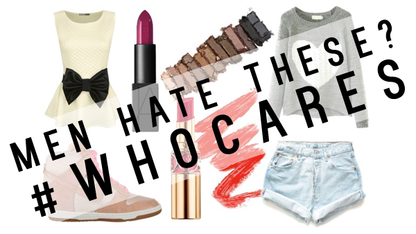
Are you sporting these fashion trends that men dislike?

in this article from huffington post, they highlighted 23 fashion trends that guys hate but women love. that includes peplum cuts, wedge sneakers, bright lipsticks, even leggings!?

in chinese there's an idiom that says "a girl dresses up for the person she adores".
that saying is so out dated, it doesn't fit in today's world anymore.

i'm telling you right now:
GIRLS SHOULD DRESS UP FOR OURSELVES.
who cares about what guys like or dislike?
i think the only rule we should live by is to like what we wear, feel comfortable in what we don on our body, and choose styles that is most suitable for ourselves.
why? here are 4 reasons:

first thing first, most guys know nothing about women's fashion.
it's just like how most girls barely know anything about cars. and a guy certainly won't choose a car using our standards!
as long as we look coordinated, it wouldn't trigger an alarm in the guy's brain.
let's face it, all the clothes look the same to guys, just like how all cars look the same to us (to me at the very least).
it's only fair to not expect them to understand how the high waisted skirt can elongate our body's silhouette, or how that pair of louboutins can lengthen our legs visually.
majority of the men are merely an audience who admire women's style as though they're looking at art pieces in the louvre - they'll go OOH that looks nice and then move on.

secondly, it's your confidence that guys latch on to, not the clothes on your body.
and where does confidence come from?
it comes from within - your acceptance of yourself, feeling comfortable with yourself, and affirmations from the external world (which mostly stemmed from the confidence you exude).
dressing for yourself will make sure you feel your best because your appearance is aligned with your own ideal.
there's really no point in wearing clothes that he likes, but you know very well how bad it'll look on you.

take for example, i know i don't look good in tube tops because it cuts into the fats around my armpit area and make me look like i have 4 boobs. just because a guy like tube top doesn't mean i have to put myself through that mental (and physical) discomfort! if i don't feel comfortable with my own appearance, i'll end up feeling awkward and NOT be myself. i know how i behave when i don't feel confident, i become less outgoing and proactive.

thirdly, who knows what suits us best other than ourselves?
well, i can tell you the secret to dressing well - choose whatever clothes that makes you feel most confident in.
ever wondered why some people can rock certain clothes well while you can't even though you both have the same body shape?
it's probably got something to do with how you feel!
if you feel like it makes you look good, it will make you look good.
if not, you'll just feel awkward and start acting all awkward too.
our behaviors reflect our inner state of mind, just make sure to let your true self shine through.

with that said, it's still important to choose clothes that suits you, one that will accentuate what you have and polish what you lack.

lastly, as the guy host in the video said..
"we don't like you in clothes".
nuff' said.

girls, please remember this by heart: you look most beautiful when you love yourself.
start loving yourself by aligning your ideals with reality by shifting both your ideals and reality towards each other.

you can thank me later :D

Tuesday, February 24, 2015

Revlon Nearly Naked Pressed Powder (020 Light Pale) [Swatch and Review]
Revlon Nearly Naked Pressed Powder (020 Light Pale)

i almost never win things, but i won this in a revlon official giveaway a few months ago from their facebook page :D but i wasn't allow to choose the colour - they sent me the shade in the middle since there are only 3 shades available in singapore's collection.

the nearly naked pressed powder claims to
1) even skin tone
2) a non cakey formula that provides a shine free finish
3) blends into skin to create lightweight finish, almost naked!

my experience, IN A NUTSHELL:
1) really non cakey/powdery formula! what!?
2) not sweat resistant
3) doesn't really even skin tone since it's so naked
4) can't detect presence of powder on my face
5) it smells very weird

Revlon Nearly Naked Pressed Powder (020 Light Pale)
the entire compact case is pretty huge, it contains a small mirror and a sponge puff.

Revlon Nearly Naked Pressed Powder Ingredients
ingredient list. that's a whole lot of yeast extract (saccharomyces) in this powder! it's use? snooped online and it only identified it as a skin conditioner.


the sponge has a really weird capability, it's really soft and squishy, and has some memory :P but i didn't use it to apply the powder. felt that it was too small to deposit the powder evenly.

Revlon Nearly Naked Pressed Powder 020 light pale swatch
in the pan, 020 light pale looks like a light beige with yellow undertone.

Revlon Nearly Naked Pressed Powder 020 light pale swatch
swatched on bare skin.

on my skin, 020 light pale looks nothing like what's in the pan, it looked more ashy and seem to match my skin tone, probably due to the low opacity of the product. it's almost invisible after i blended it out. if not for enhancing my lines on my hand, you can't tell that i've anything on.

IMHO

i've been using it for the past few months, i can't say i love it because i really dislike the scent of the product. but i do like the very natural finish it gives me. i really can't detect any powder on my face at all.

the powder itself doesn't feel like a powder. it's not powdery at all! i tried swirling my finger and it hardly picked up any product unlike my powder foundation. i swirled my brush next and nothing gets kicked up at all, a small amount of powder gets onto the brush and that's it. sometimes it frustrates me because i feel like i'm not picking up any product at all (but i actually am, just that they're really quite naked).

the only way i know i have the powder on my face is the way it takes away shine. it does a pretty good job at mattifying my face. it doesn't last the entire day though, especially if i perspired as this product isn't sweat resistant. it comes off by blotting.

this powder is a very weird powder.

i had some problem with it - there was build up on the surface, so i tried to wipe it off with a tissue. it usually does the trick, but it didn't work this time. it buffed the surface into a shiny surface. whattttt???

Revlon Nearly Naked Pressed Powder build up gunk


so i scraped it off, but the surface is still gritty no matter how many times i swirl my brush over it. i don't know why the texture is like this. while it doesn't affect the quality of the powder (it still comes off after i scraped off the build up), i don't like the sight of a gritty product. the powder on display are all super smooth for some reason. not sure if it's just this colour, or just this particular product that i own. maybe there's a slight defect?

all in all, this product does what it claims. i wish they smell nicer. and less gritty in the pan.

 
© 2012. Design by Main-Blogger - Blogger Template and Blogging Stuff. Customised by Karman 2014.