Saturday, August 26, 2017

etude house play color eyes wine party
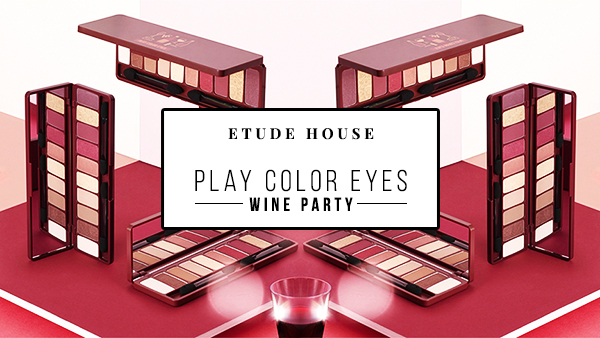
You know what time it is when you see wine shades.

It's fall, and wine/burgundy shades are in trend again! Etude House recently released an eyeshadow palette that satisfies that need for even more wine coloured eye shadows.

They're currently having an 30% off online promotion (from 16 August to 31 August). Instead of the usual price of US$26.40, you can get it for US$19.80 now! Click here to get it from their online store! I am aware I should have posted this 10 days ago.. Anyway, let's take a look at the palette.

etude house play color eyes wine party
PLAY COLOR EYES WINE PARTY | US$26.40

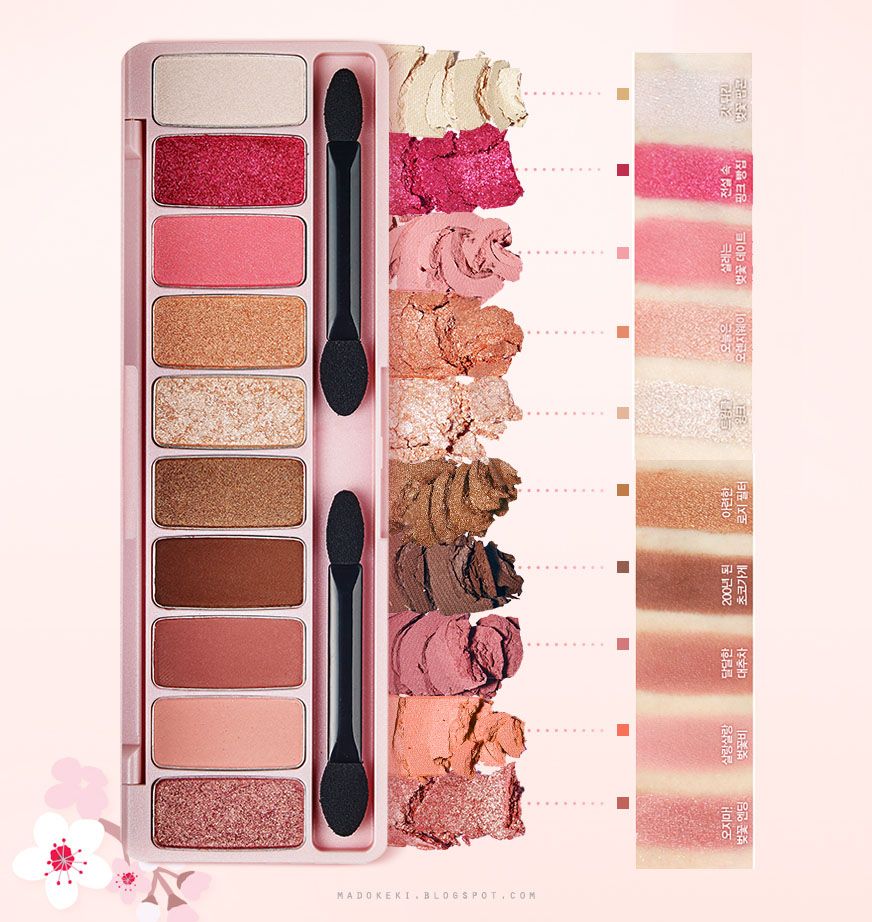
The palette consist of 10 shades: 4 existing shades from their Look At My Eyes series, and 6 brand new shades. There is a good mix of matte, satin, and shimmer.


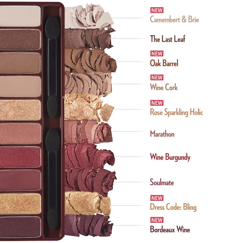
At a glance, you can see this palette is reddish toned (Duh! It's called Wine Party for a reason!). The browns also have a slight reddish hue to it, as opposed to a more yellowish brown. In between we have 3 reddish shades. At the bottom we have a purple shade. In the midst of the darker shades we have 2 golden sparkly shades.


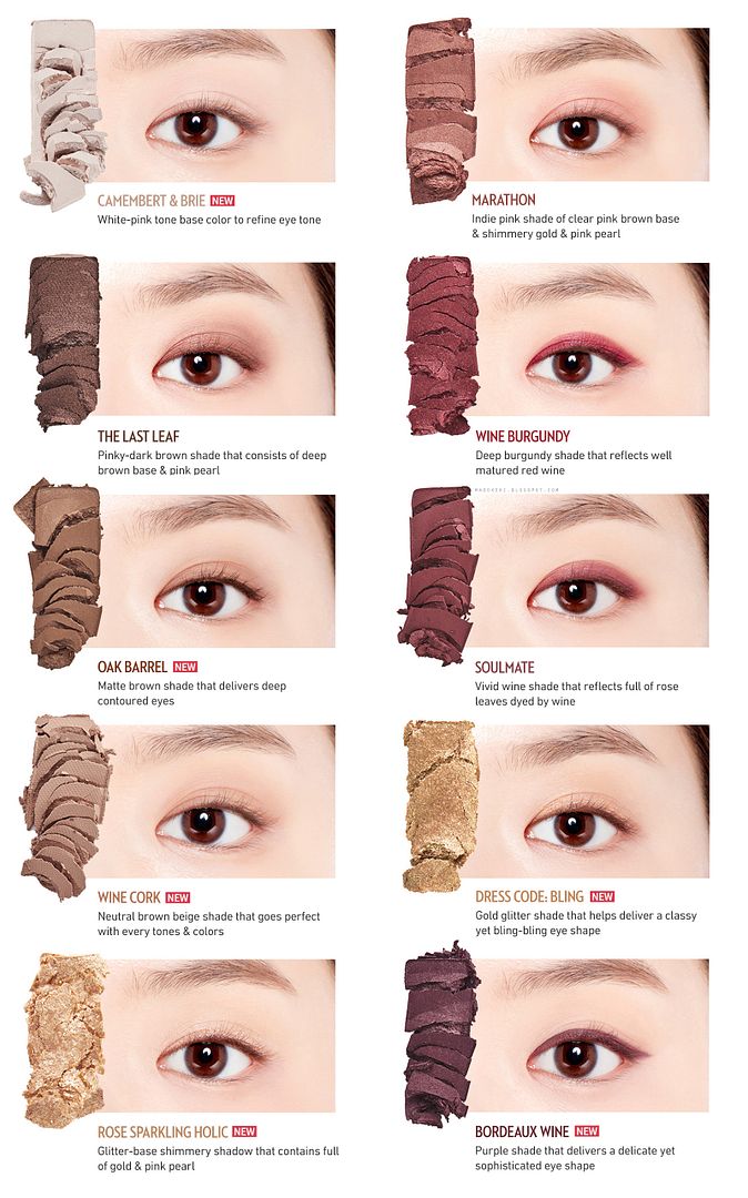
Here they are swatched on the eye individually.


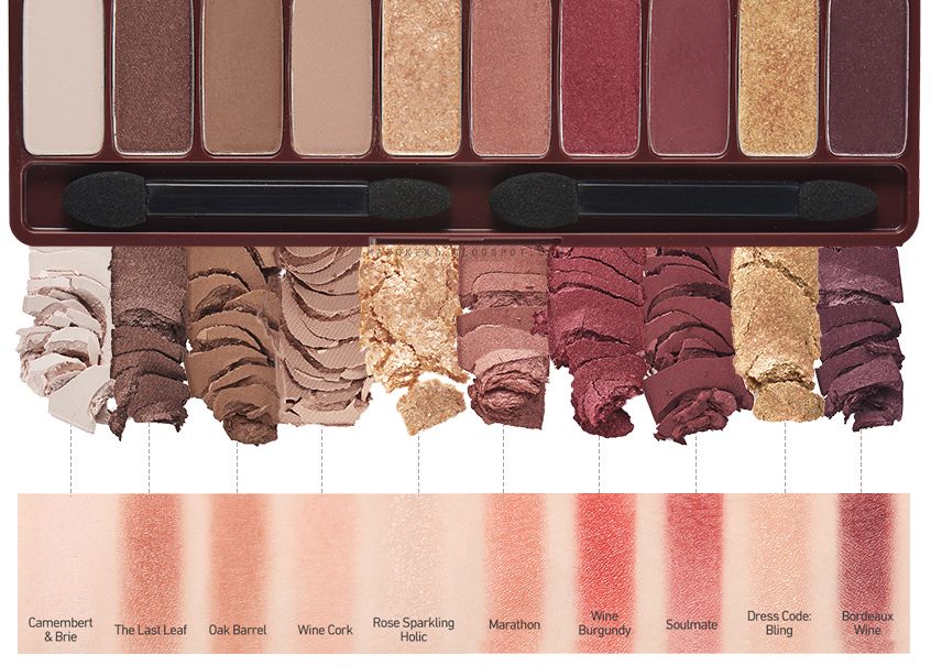
I put together the swatches and the palette into one single image. Perhaps this is easier to compare the shades' intensity as compared to what you see in the palette.

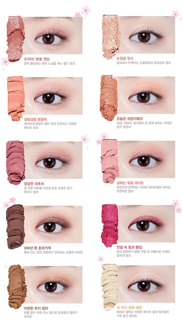
Etude House's formula has always been smooth (based on my limited experience with a few of their Look At My Eyes single eye shadows), but you can see from this official swatch that they tend to be on the sheerer side. The colour looks even, so that's a plus. I actually quite like that they apply sheer, because it makes it easier to create the soft edges that should blend seamlessly into the rest of your skin.

If you want really intense colour out of this palette, you could either use a eye primer before hand, or try using a damp brush so it picks up more pigments? Layering should help too!

I notice that the shimmer in the "not-matte" shades are rather refined. Instead of having chunky glitter or a strong frosty sheen (which sometimes looks metallic), it looks as if it's a very thin veil of golden silk - spun by the mythical gold silkworm - layered over the colours. Some people like it subtle, and maybe I'm one of them! This is the kind of shimmer that gives off a faux glossy effect, without having to smear clear lip gloss over your eyes for that wet look. It also adds a lot of dimension naturally, accentuating the natural contours of your eyes (as opposed to using a matte white shade to make certain parts of your eyes stand out).

Ending Note
This looks like a pretty great palette. If I can wear makeup right now, and if I don't already have so many eyeshadow palettes, I might get my hands on this. I don't know what's up with me, suddenly I'm really into the subtle sparkles.

Given that it's currently on offer till 31st August, it's quite a good deal at US$19.80.

Image credits: Etude House

Wednesday, April 5, 2017

ETUDE HOUSE PLAY COLOR EYES CHERRY BLOSSOM
It's cherry blossom season, on your eyelids!

What a gorgeous day it is! Finding out Etude House is releasing an eyeshadow palette that's pink! It's so new it's not even on the global site yet It just went live on the global site today.

They're having a launching special from 5th April to 12th April, instead of the original price of US $26.40, it's now going for US $18.48! It even comes with a jelly lip patch as a free gift if you order it before the promotion ends!

ETUDE HOUSE PLAY COLOR EYES CHERRY BLOSSOM
ETUDE HOUSE | PLAY COLOR EYES CHERRY BLOSSOM | USD 26.40

A new palette containing 10 lovely shades that's cherry blossom themed, each containing 0.8g of product (according to the korean site). The colour ranges from romantic pinks to wearable browns to easily create pinkish eye looks. The eyeshadows are soft and silky for easy application.

This actually looks like an expanded version of their 2016 Christmas collection, My Little Nut Fantastic Color Eyes eyeshadow palette in the shade Lucky Red Little Nut. Except the latter is geared towards a more reddish tone, hence the burgundy, while the former stays pink and light.

ETUDE HOUSE | FANTASTIC COLOR EYES (LUCKY RED LITTLE NUT) | 14000 WON

Right? They do have some semblance to each other!

ETUDE HOUSE PLAY COLOR EYES CHERRY BLOSSOM

The names of the different shades are in Korean that's too complicated for me to translate, so I left it as is (you can visit the global site as they have translated them into english!). The colours chosen for this palette has a good mix of matte, shimmer, and pearly shades. The overall colour scheme is light and fresh, in line with the cherry blossom theme.

ETUDE HOUSE PLAY COLOR EYES CHERRY BLOSSOM swatches
Click to expand!


I've did some photoshop magic to stitch together this franken-swatch photo. The swatches are taken from their official site. The swatches looks even and smooth!

As you can see there are a few matte shades (2nd-4th from bottom) that are wonderful for creating gentle depth, and shimmery shades for added dimension. Two metallic shades that appear almost frosty (5th and 6th from top).

This swatch merely gives you an idea of the colours. Below is a swatch on the eyelids for better idea of how they actually look when blended out.

ETUDE HOUSE PLAY COLOR EYES CHERRY BLOSSOM swatch
Click to expand!


They don't look as pigmented on the lids, probably because they applied it with a brush instead. Overall the shades looks like a gentle wash of colour that can be easily blended into the skin to create that soft look. Nothing too over the top for this cherry blossom inspired palette, afterall, cherry blossoms are pretty in their soft pinks, are they not?

Ending note:
This is a beautiful palette if you want soft and romantic eyes. I believe it's meant for creating diffused look, hence don't expect it to be super pigmented. Subtlety has it's perks. Of course, if you want the colours to be more vibrant, an eye primer might probably do the trick!


I'll admit my heart got swayed for a split second, suddenly desiring this new found beautiful object! Then I recall I already have a pink eyeshadow palette that I haven't been able to use for a long time.... 

My money get to live another day.

Saturday, June 4, 2016

ETUDE HOUSE NEW PLAY COLOR EYES ice van swatches
Official swatches included!

I love the colourful visuals Etude House creates whenever they launch something new!

Following the release of the peachy toned Play Color Eyes Juice Bar, Etude House wants you to have ice cream shades on your eyes this summer with their release of the Play Color Eyes Ice Van.


It's no coincidence that the promo photos are ice cream themed - the pastel shades look just like the delicious ice cream flavours! It's a pity my Korean language isn't efficient enough to translate the names of the different shades, but I'm pretty sure they are dessert themed. Just a guess.

ETUDE HOUSE NEW PLAY COLOR EYES ice van swatches

The palette contains 10 shades, some of them are new. It retails for USD26.40 on the Etude House online store.


On the left are swatches on the arm, placed next to the respective eye shadow from the palette for easy reference.


Swatched on the eyes. Check number for respective shades. I can't translate the names as they are too complicated this time round!

Ending note:
From the swatches it looks like a fun palette to have, but the colour payoff seems mediocre for the more daring shades. With that said, low pigmentation can also be spun as a "natural effect", right? So it really depends on what you're going for.

I'm just happy seeing addition of new colours, such as the hot pink (shade 5) and mint green (shade 8)!

Image credits: Etude House

Friday, November 28, 2014

Kate Jewelry Mode Eyes GN-1 Swatch Review
Kate Jewelry Mode Eyes GN-1

even though i'm a big fan of kate's eyeshadows, i never really thought of getting this one, until i saw it going for 50% one day. for about SGD10, it's worth the plunge. the colours left were limited, i swatched as much as i could on the back of my hand and this palette seems to give me that sparkly brownish champagne colour that i was looking for.

or so i thought. as it turns out, the lighting in the store was slightly different.

the naming of this palette seems somewhat misleading, perhaps we've all been to condition to link GN to green, but in this case, i THINK it stands for grey neutral. but that's just a guess, because this is clearly not a green palette.

i remember seeing the marketing material for this series before, they claim to have formulated it with special pearl and shimmer, but i don't know if it's actually that useful when it comes to describing the finish of the eyeshadow at all.

one thing you need to know, this palette can make your eyes sparkle like diamonds in the night sky (under the right lighting).


as usual, it comes with a simple instruction on how to use this palette, and as always, i didn't follow their instructions. hahaha! but still, it's a good addition for people who have no clue how to use eyeshadows, at least they have somewhere to start now!


the palette consist of three shades, two high shimmer and low pigmentation colours, and a darker liner shade which is glittery but much more pigmented than the rest. a dual sided sponge tip application (one chubby and one skinny) is included in the package. how thoughtful.

the shades were actually "named" on the palette casing, from left to right, they are the medium color, brilliant color, and dark color.

Kate Jewelry Mode Eyes GN-1 Swatch Review
swatched on bare skin, L to R:

medium color is a shimmery gun metal gray with a metallic finish under normal lighting (it looks crazy sparkly under focused light). i know it looks more taupe-ish on the pan, but once it's on my skin it just looks gray.

brilliant color is a shimmery greyish champagne with a metallic finish. it may look more yellow in the pan, but once it goes onto my skin it appears as a faint grey. this also look super sparkly under focused light, like a night sky.

dark color is a satin dark grey, it's not matte, but not overly metallic or pearly too. it contains some silver sparkles but not as overwhelming as the other 2 shades.

Kate Jewelry Mode Eyes GN-1 Swatch Review
as seen in different angles.

the metallic sheen is only highly reflective when light hits it at certain angles. as you can see from the last image, the colours are most apparent when it's not busy reflecting light like a mirror, it's a gun metal grey trio that can be used to create deep looks very easily. the sparkly shimmer also took over the metallic reflection in the last photo, partly due to the ray of focused light beaming on it from the camera flash. in fact, they have a totally different finish when seen under spot light, be sure to watch the video taken under focused light at the bottom, they gave off the most beautiful sparkle i ever seen.

i honestly do not suggest using it like the suggested instructions, because the reflective nature of the brilliant colour may make your eyes look very puffy if you happen to have puffy lids.

IMHO

as usual, the powders are soft and easily picked up with either my finger and brush. although they aren't as buttery soft as the highlight and liner shade from the colorcious diamond palette (btw, these are the predecessor, hence the semblance).

picking these up with a fluffy eyeshadow brush may cause some fall outs. whenever possible, i use my finger. they feel really buttery when i do use the latter, it seems to be the japanese formulation that gave them this buttery-powder texture.

kate's eyeshadow tend to be on the sheer (except for the dark color) and shimmery side as it's more wearable on asian eyes, this is no exception. as you've already seen from the different angles above, these will look quite sheer on your eyes until light hits it at a certain angle and bounce right off to create the metallic look.

i think they've done a pretty good job making such wearable eyeshadow palettes. while swatching the other shades, i find them very similar to the colorcious diamond. if you already own the colorcious diamond, it's almost pointless to get one of these. as a kate fan, i've seen how they recycle colour schemes to release almost similar eyeshadows but in different packaging over the years. for example, the dual blend eyes in BK-2 i own is almost similar, except for the finish (the latter has a frosted light colour shade)

these are going to be phased out as they were released in 2012. each series seem to have an average lifespan of 2 years. i can't even see them on the official website anymore. don't feel too bad if you really like it, because it's really similar to colorcious diamond in BK-1, what's more, you get an additional 2 shades with that palette.

IN A NUTSHELL
1. combination of sheer, very shimmery, and dark shades
2. powder is soft and picks up easily
3. you can give this a miss if you already own a grey palette
4. very similar to the colorcious diamond eyeshadows

MAKEUP LOOKS

Kate Jewelry Mode Eyes GN-1
medium colour is worn as a base here, with a dap of brilliant colour on my inner corner, and the dark colour on the outer corner and outer third of lower lash line (just a wash of darker colours though).

Kate Jewelry Mode Eyes GN-1
brilliant color worn as a base, medium colour on the outer half, and dark colour on the outer corner to darken things and outer third of lower lash line..

video taken under focused light, and video taken under natural light. click on the links to watch them on my instagram!

i purchased this eyeshadow palette for malaysian ringgit 26 (which is about 10SGD).


Monday, September 8, 2014

Pupa Multi-Effect Baked Eye Shadow Duo 30

this is another eye shadow that is gifted to me by my girlfriend.
you know she's a keeper when she feeds my addiction without me asking!

i'm not too familiar with pupa then (even now), she just picked this colour for me thinking it'll suit me.
it's a eye shadow duo that comes in two shades of blue.
anything baked has a good colour payoff. this is no exception.

it comes in a clear plastic case, and a dual ended sponge tip applicator.


Pupa Multi-Effect Baked Eye Shadow Duo 30 Swatch

Pupa Multi-Effect Baked Eye Shadow Duo 30 Swatch
swatched over powder foundation.

the two swatches on the left are wet swatches, while the two on the right are dry swatches.

the darker shade is a electric blue that has a iridescent/metallic/chrome finish (i can't find the right word to describe it, there is a this sheen when seen at different angles). i see some red micro glitter in it!
the lighter shade is a shimmery wash of light blue, almost a frosted finish but contains a lot of silver micro glitter and shimmer.

both the shades are very soft and pigmented, of course if it is applied wet the colour will be even more solid.
the powder are picked up easily by either a brush or fingers. i seldom use the sponge tip applicators, but when i did use it, it sort of took away that metallic sheen to the darker blue shade.

IMHO:
i seldom wear this palette on its own. i usually pair it up with the kate diamond cut palette to create an electric blue eyes. i like that the finish of the dark blue shade, for it shows its true colour as compared to shimmery or glittery shades.
this palette is so versatile as it can be worn dry or wet.
i usually apply the lightest shade on the centre of my lid to make it standout, while using the dark blue shade as an electric blue eyeliner on the outer corner of my eyes.

Monday, August 11, 2014


Etude House Look At My Eyes & Look At My Eyes Cafe

i got my gf to pick up some eyeshadows from etude house when she was travelling to korea a while ago (this is part of my haul). i picked out 6 shades from their website excruciatingly as i was struck with the dilemma of choice. with so many shades of pick from, and being spoilt by the ready-to-use japanese eyeshadow palettes, it was hard for me to pick out shades that i think will go along well with each other.

i think i did quite a good job picking out the shades by sticking close to their undertones :D I THINK.

etude house eyeshadows may be a little confusing for those of you who are new to it. there are three product lines in the "look at my eyes" series.

look at my eyes cafe - matte eyeshadows
look at my eyes - metallic/shimmery eyeshadows
look at my eyes jewel - frosty eyeshadows

i got 3 matte shades (look at my eyes cafe), as well as 3 metallic/shimmery shades (look at my eyes)


look at my eyes cafe, from left to right:
BE102 honey milk | BR401 cafe latte | PK004


look at my eyes, from left to right:
BR401 | BR402 | OR205 fever orange

Etude House Sweet Recipe Eyes BR402 Chocochip Sweet Mint Swatch
swatched over bare skin.


LOOK AT MY EYES CAFE///////
BE102: an off white (slightly yellowish) shade with matte finish.
BR401: a light brown with some pink to it. matte finish.
PK004: a wine colour with matte finish.

all the matte shades are finely milled and goes on easily (using a brush). with finger, the PK004 appears blotchy.


LOOK AT MY EYES///////
OR205: orange with golden micro shimmer. applying with finger (or wet brush) helps retain most shimmer, whereas a dry brush will get rid of most shimmer, leaving behind a wash of orange. the result is a slightly reflective shimmery finish.
BR401: yellowish golden packed with fine golden shimmer. metallic finish.
BR402: reddish toned brown packed with very find shimmer of the same shade. metallic finish.


both BR401 and BR402 are the softest and applies the smoothest out of all the shades. OR205 is slightly harder in texture and doesn't get picked up as easily as the other two. the metallic finish is most obvious if applied with fingers for all three shadows.

Etude House Sweet Recipe Eyes BR402 Chocochip Sweet Mint Swatch
swatched over bare skin, as seen in different angles

you can definitely see the obvious metallic sheen to the two brown shades. they are the most reflective of all, followed by OR205 which have a more shimmery look. the matte shades are obviously matte :P

IMHO:
i haven't mentioned the price yet, they retail for 3500won (each) in korea!!! BEST BUY EVER!?!?
they offer a REALLY HUGE selection of colours. of course, if you're hoping to look for some really exotic shades like peacock turquoise.. you'll have to look at the higher end makeup brands.

the texture of the shades are all wonder to work with, with the exception of the look at my eyes BR401 and BR402 being extraordinarily soft and buttery. all the rest are not bad in my opinion.

but using the orange shade may be a little tricky though, depending on the finish you want. for a light wash of colour, a dry brush is best. but if you want the shimmer, stick to your finger or a slightly damp brush.

MAKEUP LOOK


look at my eyes cafe BE102 over entire lid, BR401 on outer half of lid.
inner half of lower lid is dusted with the shimmery champagne shade from the lavshuca melting eyes palette.


catrice made to stay highlighting pen over entire lid, look at my eyes OR205 on outer corner and outer half of lower lash line.

can't wait to make more looks with the eyeshadows!

Sunday, August 3, 2014


SwatchSunday #3 - 1028 Visual Therapy Muse Eyeshadow 02 Essential Pink

GOOD SUNDAY!
i was roaming watsons when i saw this eyeshadow palette with a lovely colour combination. here it is, the 1028 visual therapy muse eyeshadow in shade 02, essential pink.

they're new in singapore btw.

1028 Visual Therapy Muse Eyeshadow
it's a mixture of pink and browns.


1028 Visual Therapy Muse Eyeshadow
from top left, in clock wise motion:

base colour: it's a baby pink with a pearly finish
middle colour: brown with a tinge of reddish-undertone, close to rose gold. contains shimmery and has a metallic finish.
liner colour: a dark brown with a satin finish, also contains some micro shimmery.
highlight colour: a wash of huge shimmer and glitter.

the texture for the middle and liner colour is extremely soft and smooth. the two other colour felt a little harder.

does this entice you? too bad i already have my kate colorcious diamond (the rose gold and liner shade is very similar, the only difference are the two lighter shades). and i'm still learning to work with pastel shades, so i'm giving this a pass, for now, but not for long.

xoxo
karman.

Friday, July 4, 2014


Etude House Sweet Recipe Eyes BR402 Chocochip Sweet Mint

korean brands are well known for their adorable packaging. this eyeshadow duo comes in a tin case that resembles a cupcake.


it contains two wearable shades and is easy to use.

Monday, June 30, 2014

Kate Diamond Cut Eyes BK-1

as you can see i'm starting to feel a little more brisky and adventurous with my colour choice after dabbling with make up after some time.
i think i can rock this blue palette! (keyword: i think)
this palette come with 4 colours, but i think it's actually 3 in reality, since the diamond shade on the top left is a mere wash of shimmer and glitter. there is next to no colour to them.

as usual, the packaging is the sleek black plastic case and it is embossed on the inside to make the eyeshadow appear to be grooved. it comes with a dual end sponge chip, one side is slimmer than the other to allow for more precise eye lining with the darkest shade.

a look at the website tells me that kate is probably phasing this out soon as well. i didn't know time flew by so quickly. the diamond cut eyes were introduced in spring of 2009, that's a good 5 years from then, when mika nakashima was still the spokesperson (i prefer her to the new one btw).


the "diamond" shades were the only one that has embossing on it, it has worn out a little over the years.

Kate Diamond Cut Eyes BK-1 Swatch


Kate Diamond Cut Eyes BK-1 Swatch
swatched over foundation powder.

(bottom right, bottom left, top right, gold diamond, silver diamond)
the diamond shades has a harder consistency, making it slightly harder to pick up the powder with a brush or finger. the other shades are butter smooth and soft.

from left to right,
the darkest shade is a blackish blue with silver micro shimmer. a very gorgeous shade!
the medium shade is a slightly greyish blue, with a slight pearly and shimmery finish to it.
the lightest shade is a frosted light blue, perfect for highlighting the inner corners of the eyes and brow bones.
the gold and silver contains glitter of the respective colours. it appears golden and silver in the swatch, but upon blending out only the glitters remains while the "base colour" disappears.

IMHO:
i admit i bought this palette because it looked really good on mika nakashima in the ads :X
in reality this palette is a little hard to rock as it's not a very common day time colour.
i usually wear this when i party, which serves that purpose very well because i love how the shimmer in the darkest shade brings out the contrast in the colours. ok, let's just say i'm a fan of "understated glam", i like dark bling!
also, the diamond shades adds that mysterious shine to my eyes whenever the lights flashes and hit my eyes. i can already imagine guys seeing my diamond shimmery eyes when they are high in their world, everything seems dreamy and ethereal.
even though i don't wear this palette that often, but i love it whenever i have the chance to wear this. i can't remember a time when i didn't use this palette when i hit the club. hahaha this is officially my club eye shadow palette!!!

i got this for HKD$115 in hongkong sasa.

MAKEUP LOOK


Sunday, May 18, 2014

Lavushuca Melting Eyes BR

i hope this is the last palette that is being discontinued.
i don't mean to show you something that you can't get anymore!

before lavshuca underwent a brand renewal, they used to be princess-y and elegant (unlike their currently brand image, which is a more lively and playful kind of girly-ness).
can i say i actually prefer the older packaging and brand image?

this palette comes with 4 shades, this is a brown palette, moreover the finish is vastly different from kate's gradical eyes palette.
hahaha you know what, even if they are very similar, i'd find some excuses to justify me owning this palette :P
my girlfriend bought this for me when she was in japan 4 years ago, it was a seasonal special that came with a stick eye base.

Friday, May 2, 2014

Kate Dual Blend Eyes BK-2

this is hands down the most buttery eye shadow i've ever used. i am so addicted to kate's eye shadow, for a few years their eye shadows were all that i used. i simply love their formula, their price, their colour, their packaging.. hahaha see! i told you i am biased.

this palette contains only 2 shades, a light colour and a deep colour. you can create a third colour by mixing the two, hence the funky placement of the shades.

it comes with a sponge applicator to help pack on the colour. the transparent window has diamonds embossed onto it. i am not joking when i say their packaging is beautiful! it's these little details that win my heart, because it makes this palette such a pleasing thing to my eyes even if i'm not wearing it.


Kate Dual Blend Eyes BK-2

Kate Dual Blend Eyes BK-2 swatches
swatched over foundation powder.

both the shades are extremely soft and smooth. i have never felt anything softer than these!
they apply like a dream and blends as though friction does not exist on earth.

the deep color is a dark blue/grey with silver micro shimmers.
the light colour is a frosted grey shade, rather similar in texture and finish with the lightest shade in the kate diamond cut eyes palette. it has no glitter or shimmer, but a rather foil/metallic finish.

IMHO:
while these blend out amazingly, they do smudge due to that particular reason. it's safer to wear this over primer if you have oily lids. other than that, i don't think i have anything to complain about this palette.
personally i don't blend the two colours in the palette to get a third shade. i do the blending on my eyes itself.
i just love how crazy pigmented this palette is, by far the most pigmented kate palette!

i also wear this palette to the club :P
 
© 2012. Design by Main-Blogger - Blogger Template and Blogging Stuff. Customised by Karman 2014.